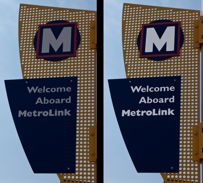
 Just starting to process photos from our hometown adventure to City Garden and the first image I get to is the one above. (Well, just the one on the left. The one on the right is the "after" image.) I bring up the image in Lightroom and look at it. I want the sky to have a little blue and not be completely blown out and white, but that results in the lettering looking gray and rather blah. Easy enough to fix, just hit "k" to bring up the adjustment brush and brush in some increased exposure and brightness on the lettering. With Auto Mask checked, I don't even have to worry too much about staying in the lines.
About half way through it hits me, "Why do I care?!?!?"